 Have you noticed Splunk just released a new version, including new data visualizations? I had been eager to start playing with one of the new charts when yesterday I came across a blog post by Bob Rudis, who is co-author of the Data-Driven Security Book and former member of the Verizon’s DBIR team.
In that post, @hrbrmstr is presenting readers with a dataviz challenge based on data from U.S. Department of Housing and Urban Development (HUD) related to homeless population estimates. So I’ve decided to give it a go with Splunk.
Even though -we can’t compare- the power of R and other Stats/Dataviz focused programming languages with current Splunk programming language (SPL), this exercise may serve to demonstrate some of the capabilities of Splunk Enterprise.
Sidenote: In case you are into Machine Learning (ML) and Splunk, it’s also worth checking the new ML stuff just released along with Splunk 6.4, including the awesome ML Toolkit showcase app.
The challenge is basically about asking insightful, relevant questions to the HUD data sets and generating visualizations that would help answering those questions.
What the data sets can tell about the homeless population issue?
The following are the questions I try to answer, considering the one proposed in the challenge post: Which “states” have the worst problem in terms of homeless people?
- Which states currently have the largest homeless population per capita?
- Which states currently have the largest absolute homeless population?
- Which states are being successful or failing on lowering the figures compared to previous years?
I am far from considering myself a data scientist (was looking up standard deviation formula the other day), but love playing with data like many other Infosec folks in our community. So please take it easy with newbies!
Since we are dealing with data points representing estimates and this is a sort of experiment/lab, take them with a grain of salt and consider adding “according to the data sets…here’s what that Splunk guy verified” to the statements found here.
Which states currently have the largest homeless population per capita?
For this one, it’s pretty straightforward to go with a Column chart for quick results. Another approach would be to gather map data and work on a Choropleth chart.
Basically, after calculating the normalized values (homeless/100k population), I filter in only the US states making the top of the list, limiting to 10 values . They are then sorted by values from year 2015 and displayed on the chart below:

The District of Columbia clearly stands out, followed by Hawaii and New York. That’s one I would never guess. But there seems to be some explanation for it.
Which states currently have the largest absolute homeless population?
In this case, only the homeless figures are considered for extracting the top 10 states. Below are the US states where most homeless population lives based on latest numbers (2015), click to enlarge.

As many would guess, New York and California are leading here. Those two states along with Florida and Texas are clearly making the top of the list since 2007.
Which states are being successful or failing on lowering the figures compared to previous years?
Here we make use of a new visualization called Horizon chart. In case you are not familiar with this one, I encourage you to check this link where everything you need to know about it is carefully explained.
Basically, it eases the challenge of visualizing multiple (time) series with less space (height) by using layered bands with different color codes to represent relative positive/negative values, and different color shades (intensity) to represent the actual measured values (data points).
After crafting the SPL query, here’s the result (3 bands, smoothed edges) for all 50 states plus DC, present in the data sets:
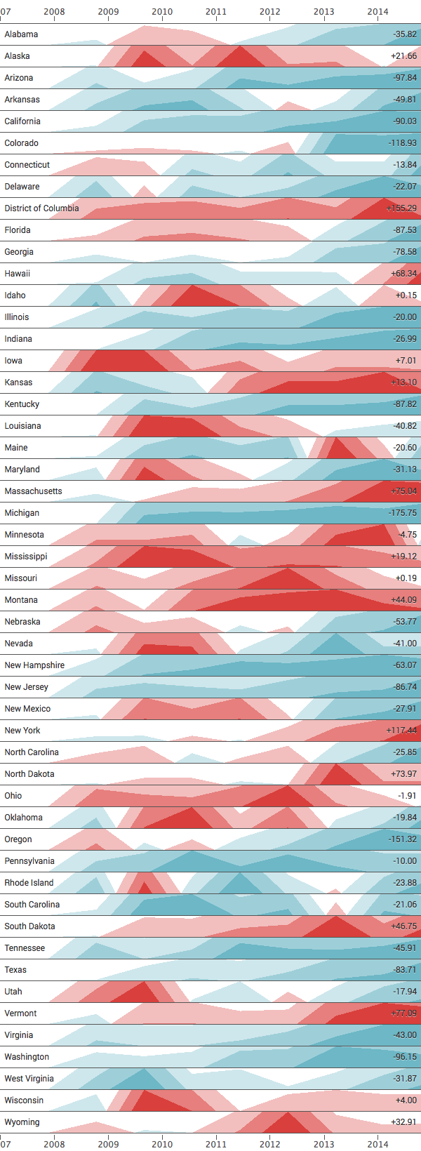
So how to read this visualization? Keep in mind the chart is based on the same prepared data used in the first chart (homeless/100k population).
The red color means the data point is higher when compared to the previous measurement (more homeless/capita), whereas the blue represents a negative difference when comparing current and last measurements (less homeless/capita). This way, the chart also conveys trending, possibly uncovering the change in direction over time.
The more intense the color is, the higher the (absolute) value. You can also picture it as a stacked area chart without needing extra height for rendering.
The numbers listed at the right hand side represent the difference between immediate data points point in the timeline (current/previous). For instance, last year’s ratio (2015) for Washington decreased by ~96 as compared to the previous year (2014).
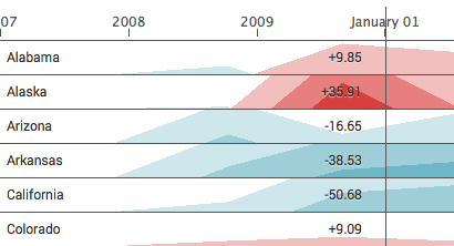
On a Splunk dashboard or from the search query interface (Web GUI), there’s also an interactive line that displays the relative values as the user hovers over a point in the timeline, which is really handy (seen below).
The original data files are provided below and also referenced from the challenge’s blog and GitHub pages. I used a xlsx2csv one-liner before handling the data at Splunk (many other ways to do it though).
HUD’s homeless population figures (per State)
US Population (per State)
The Splunk query used to generate the data used as input for the Horizon chart is listed below. It seems a bit hacky, but does the job well without too much effort.
| inputlookup 2007-2015-PIT-Counts-by-State.csv
| streamstats last(eval(case(match(Total_Homeless, "Total"), Total_Homeless))) as _time_Homeless
| where NOT State_Homeless="State"
| rex mode=sed field=_time_Homeless "s|(^[^\d]+)(\d+)|\2-01-01|"
| rename *_Homeless AS *
| join max=0 type=inner _time State [
| inputlookup uspop.csv
| table iso_3166_2 name
| map maxsearches=51 search="
| inputlookup uspop.csv WHERE iso_3166_2=\"$iso_3166_2$\"
| table X*
| transpose column_name=\"_time\"
| rename \"row 1\" AS \"Population\"
| eval State=\"$iso_3166_2$\"
| eval Name=\"$name$\"
"
| rex mode=sed field=_time "s|(^[^\d]+)(\d+)|\2-01-01|"
]
| eval _time=strptime(_time, "%Y-%m-%d&")
| eval ratio=round((100000*Total)/Population)
| chart useother=f limit=51 values(ratio) AS ratio over _time by Name
Want to check out more of those write-ups? I did one in Portuguese related to Brazil’s Federal Budget application (also based on Splunk charts). Perhaps I will update this one soon with new charts and a short English version.
